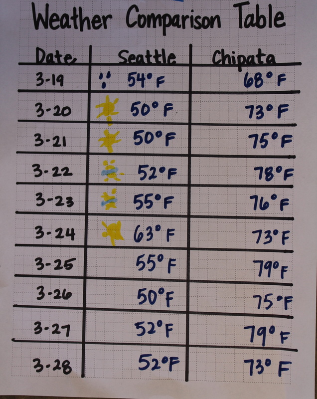
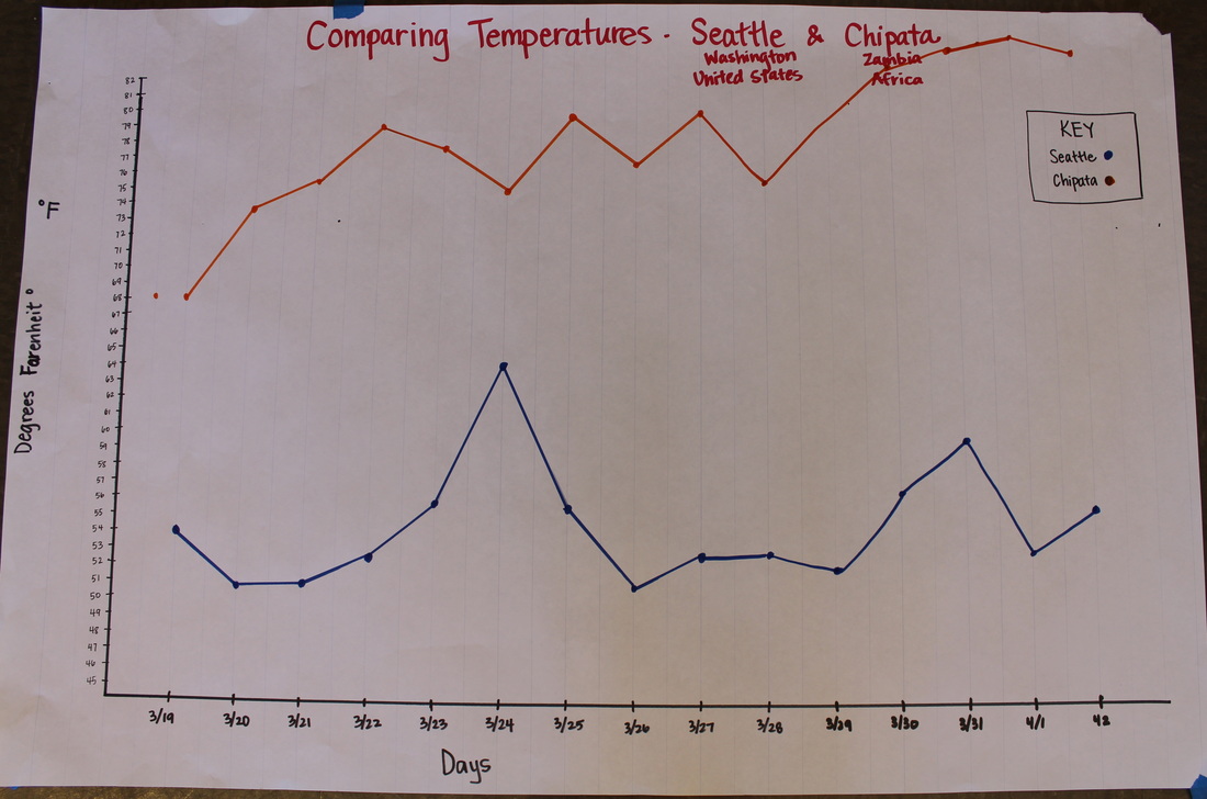
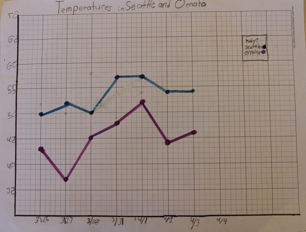
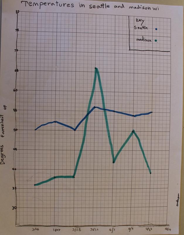
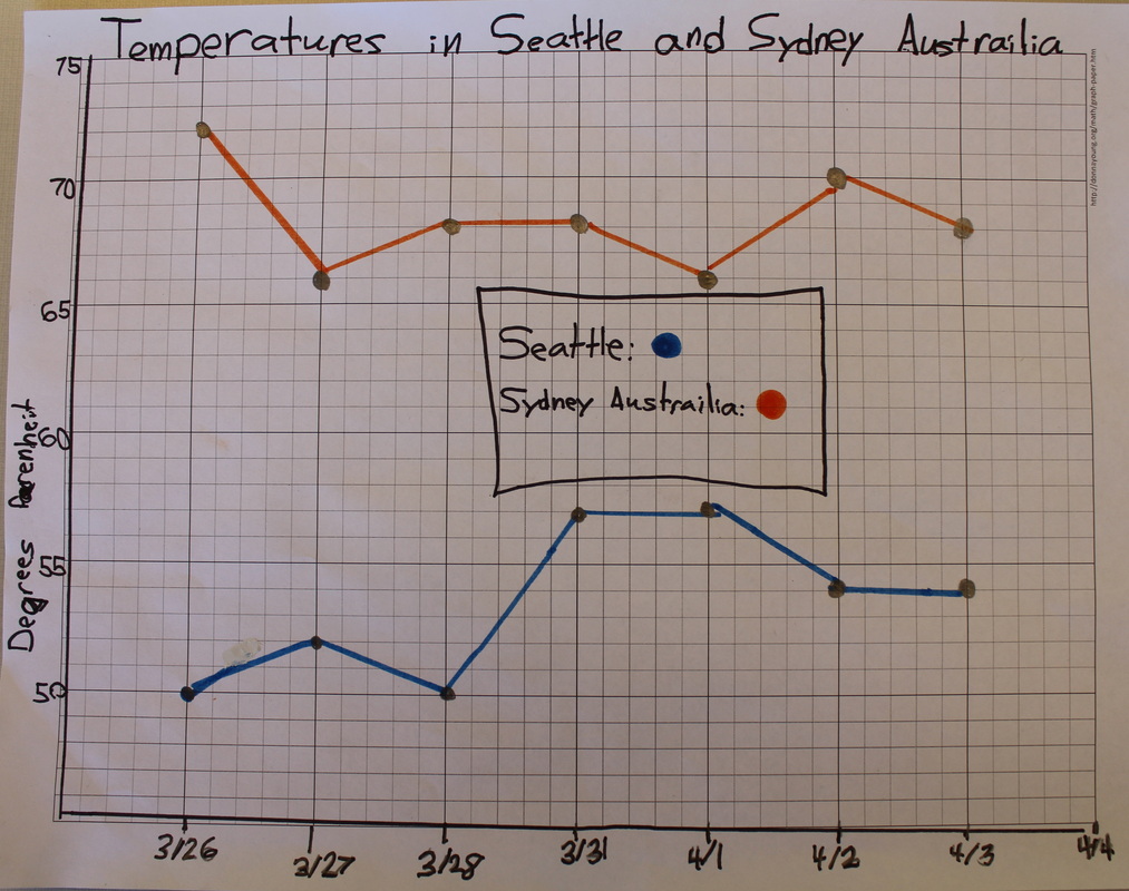
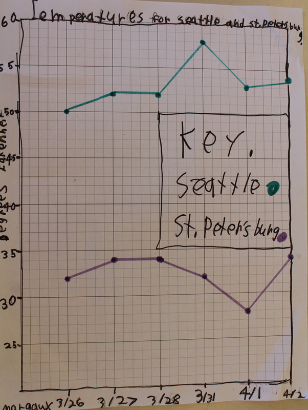
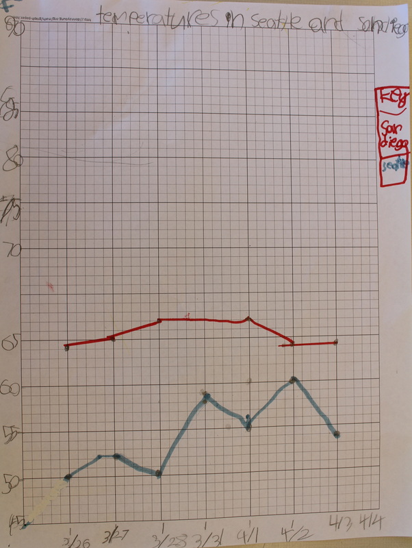
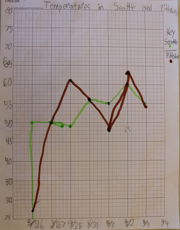
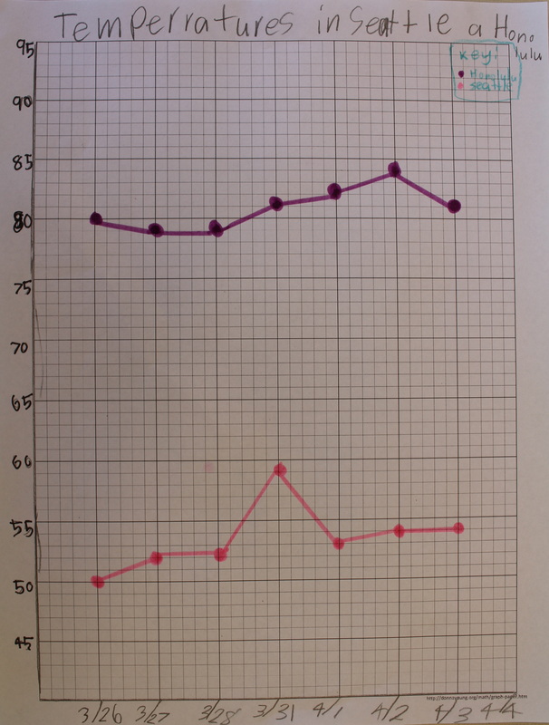
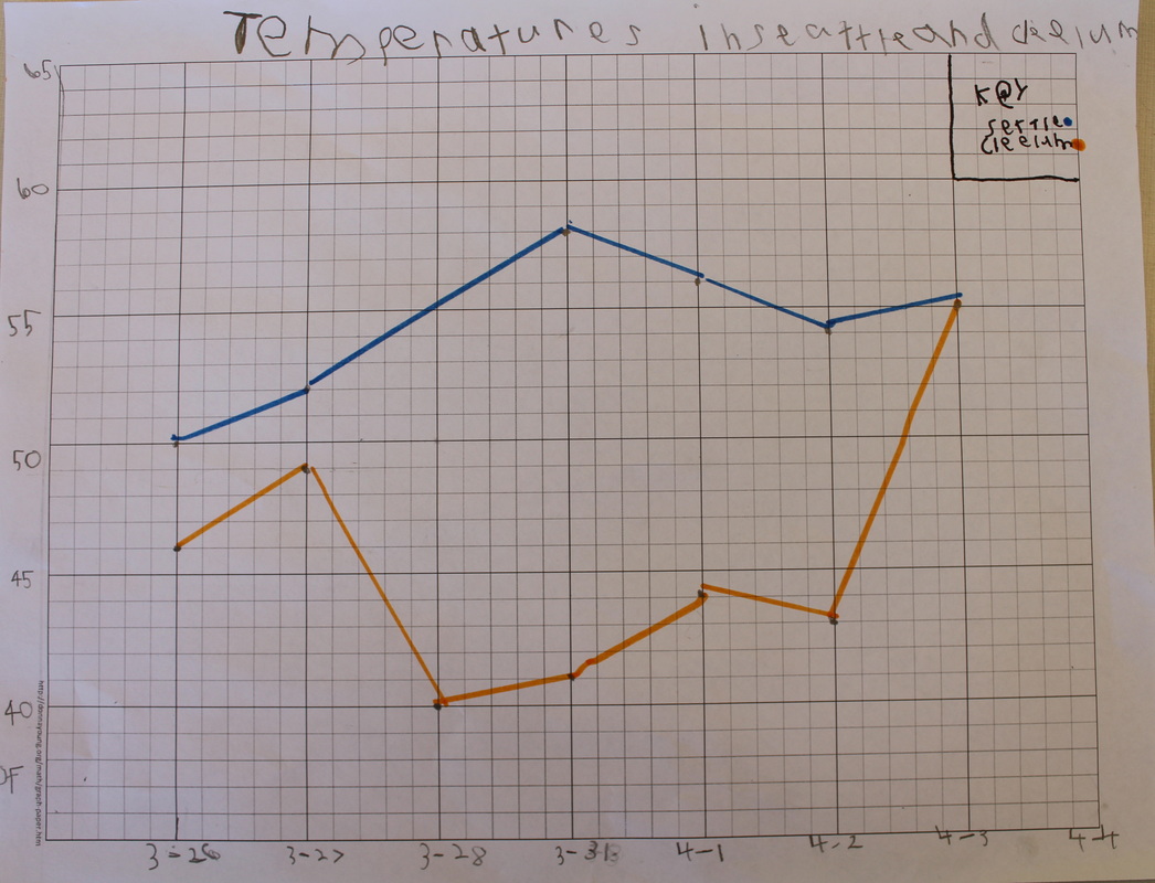
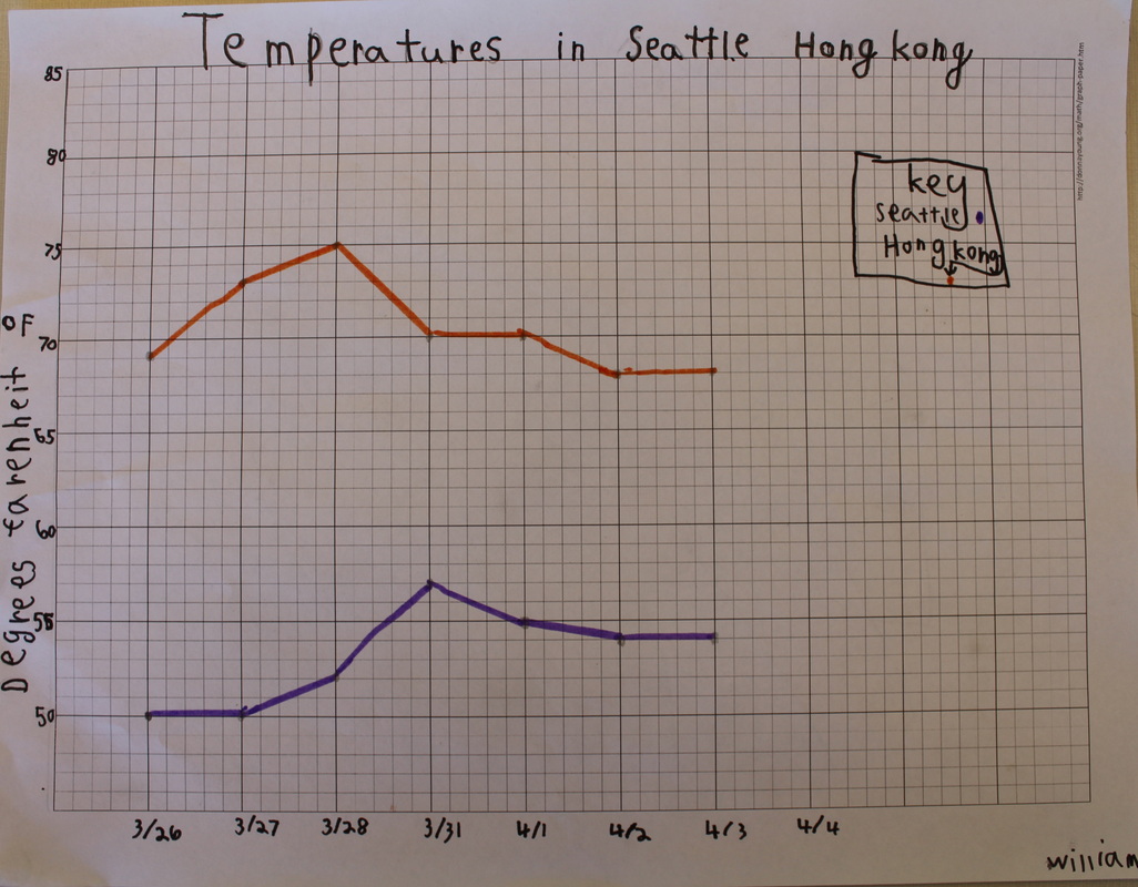
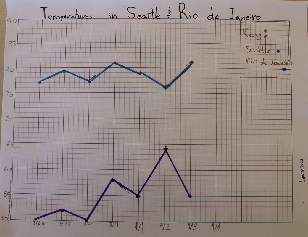
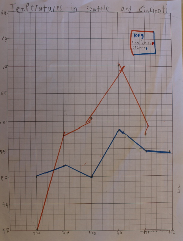
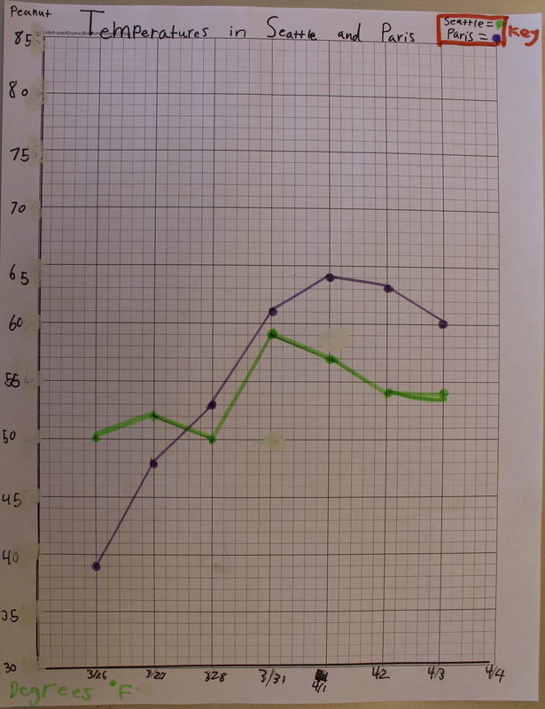
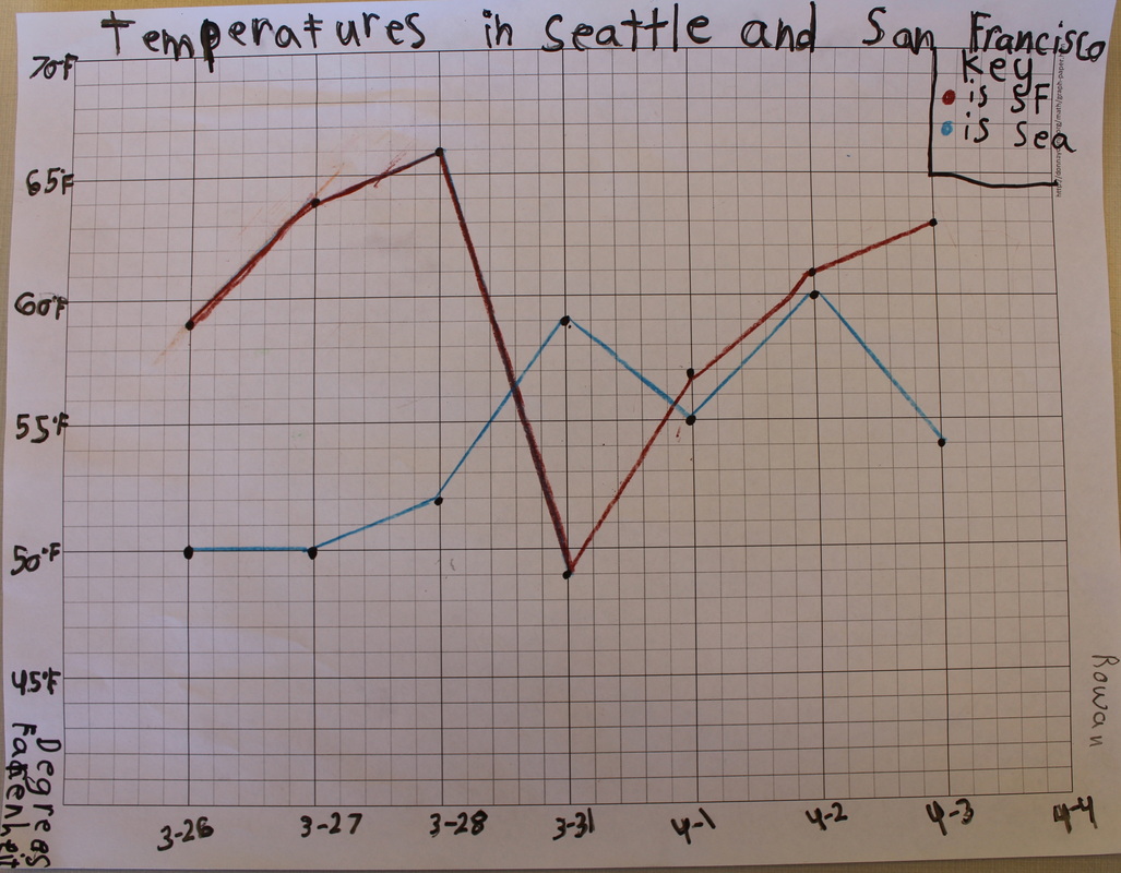
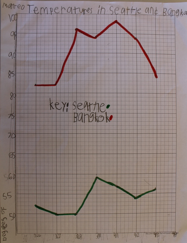
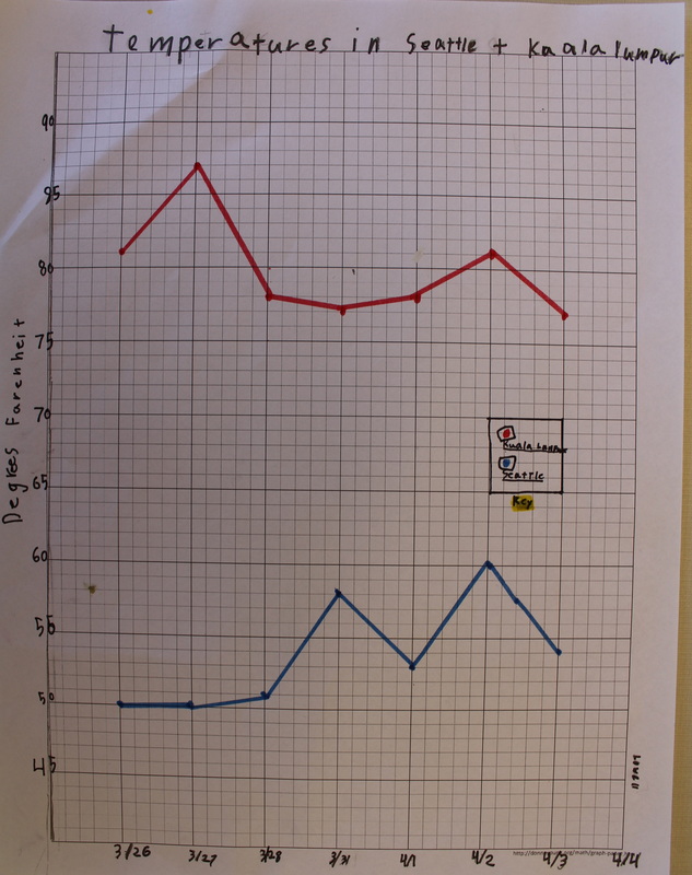
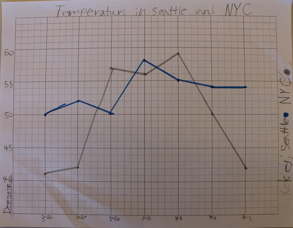
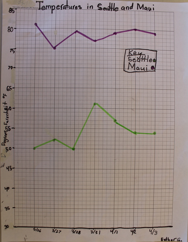

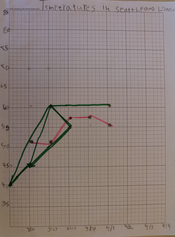
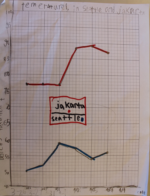
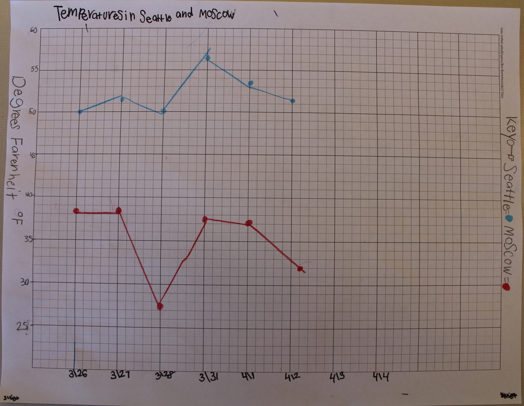
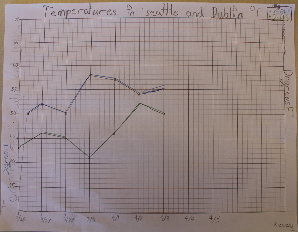
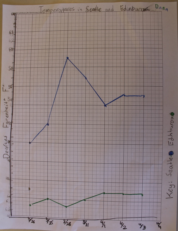

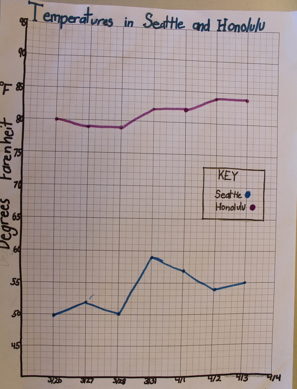
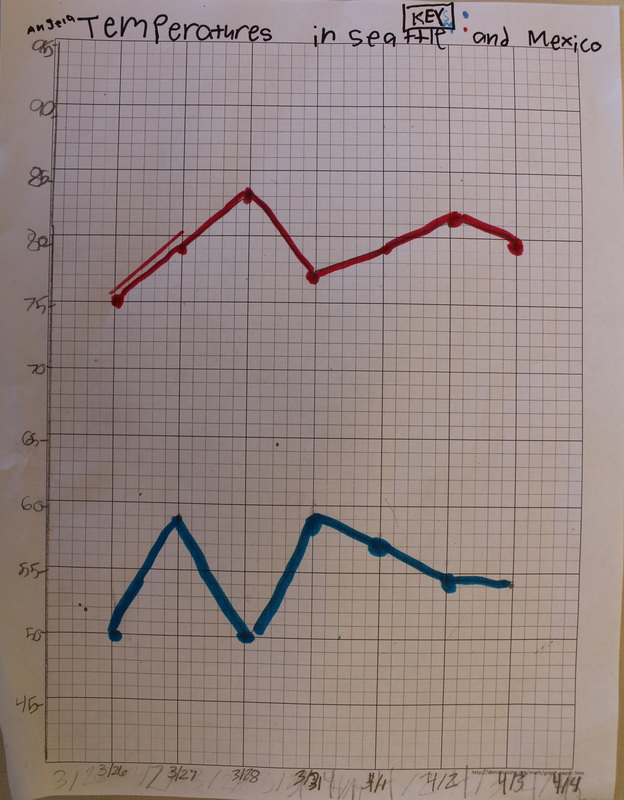
...Then our temperature line graphs may come in handy! The purpose of a line graph is to show how data changes over time. Incorporating geography, each student chose a city, looked up the temperature and recorded it on his/her own data table. We took the data and created a line graph comparing the temperatures of the two cities. This activity required keeping daily records, planning the x and y axis, labeling, determining the range of data needed (depending on temperature differences) plotting and connecting the data. Our students attended to precision and persevered through the process. In the end, we have 27 graphs to explain and analyze. Now, where would you like to visit?
|
Email Notifications:
All parents/guardians of current 2013-14 year students in Ms. Leckie's class are automatically subscribed to this blog. AuthorTell me and I forget, teach me and I may remember, involve me and I learn. -Benjamin Franklin Archives
June 2014
Categories |
 RSS Feed
